PowerWorld Simulator version 11. Manual - page 2

Getting Started With PowerWorld
Program Toolbar
The Program Toolbar gives you the ability to switch between the program’s Edit and Run Modes and to control various
aspects of the Power Flow Solution.
The options available on the program toolbar include:
Abort
Terminates the current Power Flow Solution. If the application is performing a timed simulation, pressing the abort
button will pause the simulation. See PowerWorld Simulation Control for more details.
Edit Mode
Switches the program to Edit Mode, which can be used to build a new case or to modify an existing one.
Run Mode
Switches the program to Run Mode, which can be used to perform a single Power Flow Solution or a timed
simulation with animation.
Script Mode
Opens the Script dialog, which can be used to call script commands or open auxiliary files containing script
commands and data modifications.
Log
Toggles the display of the message log window. The log window shows what is going on with the Power Flow
Solution process and may prove useful when you are trying to track down a problem with a non-converging model.
Single Solution - Full Newton (Run Mode only)
Performs a single solution of the power flow equations, as opposed to a timed simulation. The Single Solution
button allows you to use Simulator as a standalone power flow.
21

Edit Toolbar
The Edit Toolbar (Edit mode only) links to several case edit tools. You can cut or copy single objects on the oneline
diagram and paste them into the same or another diagram. You can perform the same operations with groups of
elements that have been identified through either the Select By Criteria or the Selection Rectangle tools.
This toolbar contains the following default buttons, in order from left to right:
· Cut
· Copy
· Paste
· Select by Criteria
· Rectangular Selector
22

Getting Started With PowerWorld
Insert Toolbar
The Insert Toolbar (Edit mode only) contains numerous buttons that allow you to add drawing objects to the current
oneline diagram. The buttons on this toolbar provide access to most of the activities av ailable from the Insert menu.
23

Format Toolbar
The Format Toolbar (Edit mode only) allows you to control such display object attributes as font, color, line styles,
zoom-dependent visibility, and display layer level. This toolbar also enables you to set default values for various
drawing parameters and to reset the default values when necessary. The Format Toolbar provides access to most of
the activities available from the Format branch of the main menu.
This toolbar contains the following default buttons, in order from left to right:
· Font
· Line/Fill
· Levels/Layers
· Display/Zoom Dialog
· Send to Back
· Bring to Front
24
Getting Started With PowerWorld
Case Information Toolbar
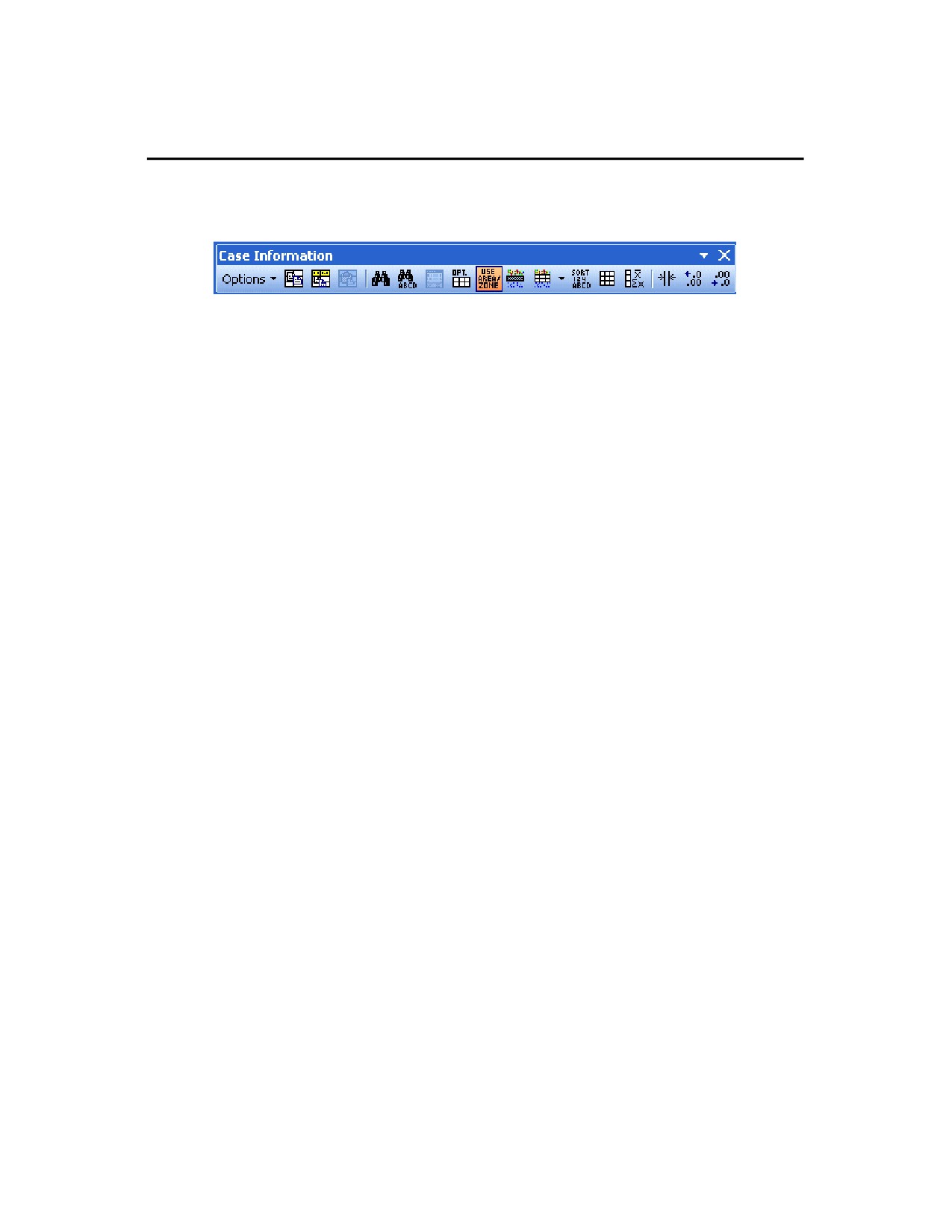
The Case Information Toolbar provides easy access to many Case Information Display options for formatting and
customizing a list display.
Options
Invokes a drop down menu similar to the Case Information Display options dialog. See Configuring the Case
Information Displays for more details.
Copy All
The Copy All menu option copies the entire record set contained in the case information display to the Windows
clipboard, from which it can be copied into other programs such as Excel for further analysis. See Copying
Simulator Data to and from Other Applications for more details.
Copy Selection
The Copy Selection menu option copies the records selected in the case information display to the Windows
clipboard, from which the selection can be copied into other programs such as Microsoft Excel for further analysis.
See Copying Simulator Data to and from Other Applications for more details.
Paste
Select Paste from the local menu to copy a record set from the Windows clipboard into the case information display.
See Copying Simulator Data to and from Other Applications for more details.
Find
Use the Find local menu option to retrieve a record pertaining to a particular element. Choosing Find from toolbar
opens the Find Dialog Box, which is used to find records pertaining to an element identified by either number or
name.
Search
Invokes the Search for Text dialog; allows you to search for specific text in a case information display.
Show Dialog
Selecting the Show Dialog option will invoke a dialog box containing more detailed information and settings
regarding the corresponding system object. For example, clicking Show Dialog while a Bus Case Information
Display is the active window opens the Bus Information Dialog.
Display/Column Options
The contents and format of the information display can be controlled using the Case Information Display Dialog.
See Configuring the Case Information Displays for more details.
Use Area/Zone/Owner Filters
Filters displayed records by selections made on the Area/Zone/Owner Filters display.
Set Area/Zone/Owner Filters
Opens the Area/Zone/Owner filter display for setting the areas, zones or owners for which the filter should apply.
Advanced Filter
Allows the user to custom filter the information in the display based on desired criteria. See Advanced Filtering for
more information.
Advanced Sort
Allows the user to custom sort the information in the display based on desired criteria. See Case Information
Display: Sorting Records for more information.
Refresh Display
Select this option to update the currently displayed data to match the present state of the system.
Get Column Metrics
This option allows you to compute the metrics for the selected column. Choosing Get Column Metrics from the
local menu will bring the Grid Metrics Dialog. This option is only available for columns whose content is numeric.
Auto Size all Column Widths
25
Constrains all field widths to contain the widest data elements in each column.
Increase/Decrease Decimals
Adjusts the number of displayed decimal places for all cells in the selected column in a case information display.
26

Getting Started With PowerWorld
Zoom Toolbar
To display large detailed power systems, Simulator’s onelines possess zooming and panning capabilities. The Zoom
Toolbar enables you to prescribe a zoom level either by directly specifying a zoom value or by selecting a rectangular
region of the diagram on which to focus. In addition, this toolbar enables you to save a view location, or recall a
previously saved view location. This toolbar also links to a dialog box from which you can select a bus on which to
center the display. See Zooming and Panning for more information.
This toolbar contains the following default buttons, in order from left to right:
· Zoom Area
· Zoom In
· Zoom Out
· Present Zoom Level
· Show Full Oneline
· Find Object on Oneline
· Save Oneline Views
· Show Screen Layers Display
27

Options/Info Toolbar
The Options/Info Toolbar provides quick access to Simulator’s many information displays and option settings. Use this
toolbar to set simulation and solution options, define area/zone/owner filters, perform a Single Power Flow Solution,
generate quick power flow lists and the bus view displays, and to switch to other open oneline diagrams.
This toolbar contains the following default buttons, in order from left to right:
· Case/Simulation Options
· Oneline Options
· Default Drawing Options
· Show Area/Zone/Owner Filters Display
· Dynamic Formatting for Case Info and All views and Onelines
· Dynamic Formatting for Active Oneline
· Display Quick Powerflow List
· Display Busview
· Display Substation View
· Toggle Onelines
28

Getting Started With PowerWorld
Run Mode Toolbar
The Run Mode toolbar offers access to various Run Mode activities. It features VCR-like controls for starting,
resetting, and pausing the simulation. It also links to Run Mode tools such as contouring, difference flows, and fault
analysis.
This toolbar contains the following default buttons, in order from left to right:
· Play
· Pause
· Contouring
· Difference Flows
· Fault Analysis
29

Solution Options Toolbar
The Solution Options Toolbar provides access to most of the solution options contained in the Solution Options dialog
in an individual manner through menu commands.
This toolbar contains the following default buttons, in order from left to right:
· Open the Solution Options
· Enable/Disable Using DC Approximation
· Solution Tolerance
· Maximum Solution Iterations
· Enable/Disable Only One Iteration
· Enable/Disable Enforcing Generator MW Limits
· Enable/Disable Automatic Generation Control (ACE)
· Enable/Disable Generator MVAR Checking
· Enable/Disable Switched Shunt Control
· Enable/Disable Transformer LTC Control
· Enable/Disable Phase Shifter Control
· Enable/Disable Balancing Parallel LTC Taps
· Enable/Disable Checking Generator MVAR Immediately
· Maximum Outer Control Loop Iterations
30

Getting Started With PowerWorld
Animated Flows Options Toolbar
The Animated Flows Options Toolbar provides access to most of the solution options contained in the Animated Flows
Options dialog in an individual manner through menu commands.
Animation Options
Invokes a drop down menu representative of the Animated Flows Options dialog.
Show
Determines whether power flows are animated on the onelines. If this option is not checked, then no flow symbols
appear on the oneline.
Flow Visualization Type
Animated flows on onelines may depict either actual power flows or power transfer distribution factors, depending
on what you choose here. You can also now choose to animate both the MW and MVAR flows or the MW and
PTDF flows simultaneously.
Animated Flow Density
Determines the relative density of the animated flows on the devices. Increasing this value causes Simulator to
display a greater number of flow symbols per unit distance on the oneline. This value may range from 1 to 999.
Animated Flow Size
Determines the relative size of the animated flows on the devices. Increasing this number increases the size of the
flow symbols. This field may range from 1 to 999.
Automatically Set Size, Density, and Parameters for this oneline
Simulator detects the current zoom level and object parameters of the selected oneline diagram, and automatically
adjusts the animation settings in an attempt to optimize the animation quality.
Animate Flows
This option determines whether or not the flow arrows are mobile or stationary on the oneline diagram. If the button
is depressed, the flow arrows are mobile..
Animate Size
If depressed, the size of the animation symbols will vary to represent the quantity of flow on the element (respective
of the Animation Parameter.) Otherwise, the symbol size will be the same on all devices regardless of the quantity
represented.
Scale Speed of Flows
If depressed, the arrows flow at a speed proportional to the represented quantity. If not depressed, all arrows move
at the same speed.
31

Pie Chart/Gauge Options Toolbar
The Pie Chart Options Toolbar provides access to most of the solution options contained in the Pie Charts Options
dialog in an individual manner through menu commands.
This toolbar contains the following default buttons, in order from left to right:
· Open the Pie Chart Options
· Type of value represented
· Percentage at which Text Percentage Value is Displayed in the Pie Chart
· Normal Level Size Scaling Factor
· Normal Level Color
· Warning Level Percentage
· Warning Level Size Scaling Factor
· Warning Level Color
· Emergency Level Percentage
· Emergency Level Size Scaling Factor
· Emergency Level Color
32

Getting Started With PowerWorld
Thumbnail View Options Toolbar
The Thumbnail View Options Toolbar provides access to most of the solution options contained in the Thumbnail View
Options dialog in an individual manner through menu commands.
This toolbar contains the following default buttons, in order from left to right:
· Open the Thumbnail Options
· Location of Thumbnail View
· Size of Thumbnail View, as a percentage of the window size
· Zoom out multiplier
· Enable/Disable Using the Same Background as the main window
· Background Color, if not the same as the main window
· Percent Transparent
33

Contouring Options Toolbar
The Contouring Options Toolbar provides access to most of the solution options contained in the Contour Type
Options dialog in an individual manner through menu commands.
This toolbar contains the following default buttons, in order from left to right:
· Open the Contour Options
· Recalculate the current contour
· Remove the current contour
· Maximum Value
· Break High Value
· Nominal Value
· Break Low Value
· Minimum Value
· Ignore Above Maximum
· Ignore Below Minimum
· Use Absolute Values
· Reverse Colors in Color Map
· Brightness
· Color Map Selection
· Enable/Disable Drawing Color Key
· Enable/Disable Continuously Update Contour
· Resolution
· Influence Region
34
Getting Started With PowerWorld
Oneline Options Toolbar
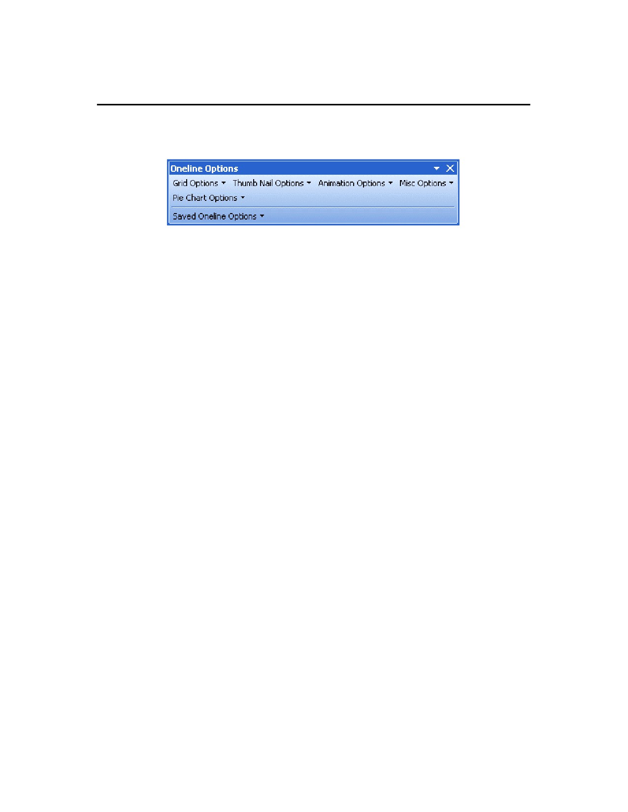
The Oneline Options Toolbar provides access to most of the solution options contained in the Oneline Options dialog
in an individual manner through menu commands.
35

Toolbars Customization
To access the Customize Toolbar dialog, select Window > Toolbars > Customize… or right-click on any toolbar and
select Customize…
The dialog has three tabs: Toolbars, Commands and Options.
Toolbars Tab
This tab sheet allows the user to:
Rename a toolbar
Delete a toolbar
Activate or deactivate a toolbar
·
Click the check box to activate (or deactivate) the specific toolbar.
Add a new toolbar
·
Click the New button and assign the toolbar a name.
·
Add commands to the toolbar using the Commands tab.
Reset a toolbar
·
Click the Reset… button to reset the currently highlighted toolbar in the Toolbars list box to the state it was in
when Simulator was installed.
·
A prompt appears, asking if the user really wants to reset the changes made to the toolbar. Click Yes to
confirm the resetting.
36

Getting Started With PowerWorld
Commands Tab
This tab sheet allows the user to add (or remove) icons and commands to (or from) menus and toolbars.
To add a command to a toolbar or menu:
·
Select the command category in the Categories list box. The commands available appear in the Commands
list box.
·
Click on a command in the commands list box and drag it to an existing menu or toolbar.
·
An I-beam appears when the cursor is placed over a valid position to drop the command.
·
Release the mouse button at the position you want the command inserted.
Notes:
·
A small button appears at the tip of the mouse pointer when you drag a command. A bold X below the pointer
means that the command cannot be dropped at the current cursor position.
·
The bold X changes to a + sign when the mouse moves over a toolbar or menu.
·
Placing the cursor over a drop-down menu item opens the associated menu. You may then drag and drop
the command at the desired location in the menu.
·
Commands can be placed in menus or tool bars. If you created you own toolbar you can populate it with your
own commands/icons.
To remove a menu, command or toolbar icon:
·
Click on the menu name, menu entry, or toolbar icon you want to remove. Next, drag the item off of all
toolbars and menus.
·
Release the mouse button when the + symbol below the mouse pointer changes to a bold X.
37

Options Tab
This tab sheet allows the user to set general environment settings.
Menus show recently used commands first
Check this box if you want the menus to show your recently used command first.
Show full menus after a short delay
Check this box if you want the full menus be shown after a short delay. This option is only active if the preceding
option is checked
Reset my usage data
Click this button to reset the usage data, which includes the information about the recently used commands.
Large icons
Check this box to use larger versions of the icons, instead of the standard size icons.
Show ToolTips on toolbars
Check this box to display a popup ToolTip when the mouse pointer is placed over an icon in any of the icon
toolbars. The popup contains a short description of the icon function, as well as the associated keyboard shortcut, if
one has been assigned.
Show shortcut keys in ToolTips
Check this box to have the shortcut displayed in the ToolTip.
Menu animations
Animation options include (None), Random, Slide and Unfold.
38
Using Oneline Diagrams
Chapter 2: Using Oneline Diagrams
Simulator has been designed to be both highly graphical and interactive. The key to making effective use of Simulator
lies in understanding the oneline diagrams. This chapter provides essential information on how to use and customize
onelines.
The following material is included:
· Oneline Diagram Overview
· Oneline Tools and Options
· Printing Oneline Diagrams
· Relationship Between Display Objects and the Power System Model
· GIS Tools
39
Oneline Diagram Overview
The purpose of the oneline diagram is to show information about the power system graphically. Such displays are
called oneline diagrams (onelines) because the actual three-phase power system components are represented using
a single line. Simulator onelines "come alive" via:
· Animation
· Contouring
· Zooming and panning capability and
· Conditional display of objects
Additionally, a key aspect of Simulator is the ease with which it allows you to examine and modify many of the objects
shown on the oneline diagram.
You may open any number of oneline diagrams, including multiple copies of the same oneline.
40
Using Oneline Diagrams
Relationship Between Display Objects and the Power System Model
Display Object: An item shown on a oneline diagram. Display objects typically have an associated model object.
Examples include buses, transmission lines, transformers, generators and loads. Display objects not associated with
a model object are called unlinked objects.
Model Object: A power system element contained in a case.
A key strength of the Simulator is its ability to allow users to manipulate a power system model graphically. This
capability greatly simplifies the work involved in developing or maintaining a power system case for both novice and
advanced users. However, it is important to keep in mind the distinction between the display objects shown on the
onelines and the actual power system model, consisting of model objects. A key concept is that any number of display
objects, including none at all, can be associated with a single model element.
Simulator uses a bus-oriented model. In other words, the model objects are either the buses themselves, objects that
are radially attached to a bus (i.e., loads, generators and switched shunts), or objects that join two buses (i.e.,
transmission lines, transformers or dc lines). As long as there is a one-to-one mapping between display objects and
model objects, the distinction between the two could be made entirely transparent to the user.
It is reasonable, and often quite useful, to use more than one display object to represent a single model object. For
example, by using the Conditional display of objects feature, two bus display objects could be used on a single oneline
to represent the same bus. One bus might be visible over a particular zoom range, while another, with perhaps a
different size/thickness, is visible over another range. Alternatively, the same bus could be represented using display
objects drawn on separate onelines.
An ambiguity arises when the user uses the Cut command to delete an object. Is he or she deleting just the Display
Object or both the Display Object and the Model Object? To alleviate the problem, Simulator prompts you when you
are deleting a display object with an associated model object to delete both the Display Object and its associated
model object record, delete just the display object, or cancel the delete.
In addition, there is no requirement that model objects have a corresponding display object. Thus, you could use the
oneline diagram to show just a fraction of the total system buses and other devices. You can use the Case
Information menu to view the model objects directly regardless of whether or not they are shown on a oneline.
41
Oneline Tools and Options
Oneline Local Menu
The local menu provides access to a number of options and tools directly from the oneline. To display the local menu,
position the cursor on an empty portion of the oneline then click the right mouse button. While most options are
always available on the popup menu, a few options are only available on the popup menu in run mode.
Find Object on Oneline (Edit and Run Modes)
Displays the Find Object on Oneline tab of the Zoom, Pan, and Find Objects dialog.
Oneline Display Options (Edit and Run Modes)
Displays the Oneline Display Options dialog. This dialog allows you to customize the appearance of the oneline.
Pan/Zoom Control (Edit and Run Modes)
Displays the Zoom/Pan tab of the Zoom, Pan, and Find Objects dialog.
Area Information Dialog (Edit and Run Modes)
Displays the Area Information Dialog for the bus nearest the cursor when the local menu was opened
Contouring (Run Mode Only)
Displays the Contour Options Dialog. This dialog allows you to contour the system voltage magnitudes or angles.
Difference Flows (Run Mode Only)
Displays the Difference Flows Dialog. This dialog is used to compare two power system operating points.
Toggle Flow Visualization (Run Mode Only)
Switches the oneline's animated flows between displaying actual flows and power transfer distribution factors.
Dynamic Formatting (Active Oneline) (Edit and Run Modes in Oneline Diagrams)
Displays the Dynamic Formatting Dialog. This dialog is used to change the rendering of objects in oneline diagrams
according to the state of the represented object in the power system.
Dynamic Formatting (All Views) (Edit and Run Modes in Bus and Substation Views)
Displays the Dynamic Formatting Dialog. This dialog is used to change the rendering of objects in bus and
substation views according to the state of the represented object in the power system.
Edit Screen Layers (Edit and Run Modes)
Opens the Screen Layers case information display.
Show Layer (Edit and Run Modes)
Allows activation of any saved screen layer.
Print Oneline
(Edit and Run Modes)
Sends a copy of the oneline diagram to the printer. Selecting this option has the same affect as selecting File,
Print Oneline from the main menu. See Printing Oneline Diagrams for more information.
Copy Image to Clipboard (Edit and Run Modes)
Copies the oneline file into the Windows clipboard using the Windows Metafile format (*.w mf). You can then paste
the oneline into another program, such as a word processor. See Copying Onelines to Other Programs for details.
Export Image to File (Edit and Run Modes)
Saves a copy of the entire oneline diagram image to a file. Oneline image files can be saved in bitmap (*.BMP),
Windows Metafile (*.WMF, .EMF), or JPEG format (.jpg).
Toggle Full Screen (Run Mode Only)
Sets the oneline diagram display window to full screen size. This option hides all toolbars and status bars. To
return the window to normal, right-click on the oneline diagram and un-check the Full Screen option.
Borderless (Run Mode Only)
Toggle this option to hide all borders currently displayed on the diagram.
Embed a Display (Run Mode Only)
Clicking on this option allows you to open another oneline diagram (or the same one) and embed the new display
inside the existing display. You can choose what percentage size the embedded display should be, and w here
within the existing window the embedded window should be placed.
Save/Edit/Delete View (Edit and Run Modes)
42
Using Oneline Diagrams
Displays the Save View Level Dialog. This dialog is used to set def ined locations on the oneline for recalling
specific views from a list of saved views.
Go To View (Edit and Run Modes)
Allows the user to go to a specific location and zoom level on the oneline by choosing from a list of saved views.
This option does nothing if no views are saved.
Form Control > (Edit and Run Modes)
Options on this submenu allow you to resize the window, shift the window, or close the window.
43

Oneline Display Options Dialog
The Oneline Display Options dialog allows you to customize the display of the oneline diagram. You can access this
display by either right-clicking anywhere on an empty portion of a oneline and selecting Oneline Display Options
from the resulting oneline local menu or selecting Options > Oneline Display from the main menu. This dialog
houses several tabbed pages that govern various aspects of the oneline display. See Display Options, Pie Charts,
Animated Flows, Thumbnail View, Grid/Highlight Unlinked Objects, Memo, Movie or Substation for information on the
respective tabs.
Oneline Display Options Dialog
Save Options to Case
Of important note is the general option at the bottom of this dialog labeled Save Options to Case. What this allows
you to do is define a set of oneline options in the dialog, and then save that definition of optionsin the case by
giving the definition a name. Once you have named that set of options, you can recall it later by coming back to this
dialog and choosing the name from the list of option set names that appears near the bottom of the dialog. You can
define as many different sets of custom options as you wish. You can also use an option set saved with the case
when you create a oneline view using the Save Views dialog.
44

Using Oneline Diagrams
Display Options
Oneline Display Options Dialog - Display Options Tab
Display Detail
The Display Detail box allows you to control how much information is shown on the oneline display. There are four
choices:
Minimal
Show the oneline background, branch circuit breakers, generator MW output,
and load MW/MVR.
Moderate
Show all Minimal information, along with bus voltages and all line flow pie
charts.
Complete
Show all information.
Custom
Selecting this option and then clicking the Set… button opens the Custom
Detail Dialog, which allows you to customize the oneline diagram to hide
objects that do not meet your desired specifications.
Of course, in order for a certain display object to appear, it must have been placed there by the person who
designed the oneline.
Emphasize Specific Objects
This option allows you to choose to "emphasize" desired elements on a oneline diagram. The emphasis is in the
form of the emphasized elements being in full color, with de-emphasized elements being muted colors.
45
To choose emphasis of certain elements, first check the box labeled Do Emphasis. When you first check this box,
it will open the Emphasis Filter dialog, which looks and works very similar to the Select By Criteria tool. You can
choose the oneline elements you wish to emphasize, and include filtering by area, zone, voltage, and screen layer.
The degree of emphasis (muting of de-emphasized elements) can be controlled by the Emphasis Amount slide
bar.
Background Color
Select Change Background Color to select a different color for the oneline diagram background color. Select the
Set as Default Background Color option to set the background color as the default for all oneline diagrams.
Voltage Options
Voltages may be expressed in either actual units (kV) or per-unit.
Use Absolute Values for MW Line Flows
If checked, this option will cause all MW flow text fields for lines to be displayed as the absolute value of the flow.
Otherwise, the MW flow text fields will be positive near the source end of the line and negative near the sink end of
the line.
Use Absolute Values for Mvar Line Flows
If checked, this option will cause all Mvar flow text fields for lines to be displayed as the absolute value of the flow.
Otherwise, the Mvar flow text fields will be positive near the source end of the line and negative near the sink end of
the line.
Use Absolute Values for MW Interface Flows
If checked, this option will cause all MW flow text fields for interfaces to be displayed as the absolute value of the
flow. Otherwise, the MW flow text fields will be positive near the source end of the interface and negative near the
sink end of the interface.
Enable Mouse Wheel Zooming
When this box is checked, zooming can be done with a mouse wheel. The default is off.
Change in Generator Rotor Angle Per Refresh (degrees)
Generator display objects are drawn with a dog bone rotor whose angle relative to the horizontal can be used to
represent the generator internal angle. Enter a nonzero value to make use of this feature.
Visualizing Out-of-Service Elements
Out-of-service elements can have optional visualization settings that makes them "stand out" in relation to in-service
devices on the oneline diagram. The options for out-of-service devices includes Use Dashed Lines, Draw and X
Through Off-Line Generators, and Blink . Additional controls for the Blink option are available, for setting the blink
interval and color. Any combination of these options can be used for out-of-service elements, although the X option
only applies to out-of-service generators.
Percent of Substation and Injection Group object height used by name
When Substation and Injection Group objects are drawn on a oneline diagram, they can include a string inside the
object displaying the name. This setting determines how big the name should appear, relative to the size of the
object.
Browsing Path for Oneline Diagrams
This option applies when you have Oneline Links included on a oneline diagram. Rather than specify the full path
and name of a oneline diagram as a oneline link, you can specify the file name only. When the link is clicked in Run
Mode, Simulator will check all directories listed here, in order, to try and find the oneline file name stored with the
link.
46

Using Oneline Diagrams
Pie Chart/Gauge Options
Oneline Display Options Dialog - Pie Charts / Gauges Tab
Show Pie Charts/Gauges in Run Mode
When this option is checked, the pie charts and line gauges will be visible during Run Mode. Otherwise, they will be
visible only during Edit Mode.
Only Show Pie Charts/Gauges if relevant data exists
The relevancy of pie charts and gauges depends on the style of the pie chart or gauge. For MVA, MW, Mvar and
Amp styles, the pie charts are considered irrelevant if the limits on the line or interface are 0. For max percent
loading under contingency, the pie chart is irrelevant if no violation(s) under contingency occurred on the element.
For the PTDF style, the pie chart is invalid if the PTDF value has not been calculated for the line or interface.
The options for pie charts and gauges are split into three sections, discussed in the additional topics:
Pie Charts/Gauges: Lines
Pie Charts/Gauges: Interfaces
Pie Charts/Gauges: General Options
47

Pie Charts/Gauges: Lines
Oneline Display Options Dialog - Pie Charts / Gauges for Lines
Pie Chart / Gauge Style
The Pie Chart Style box determines whether the line flow pie charts show the percentage loading of the line based
upon the MVA flow, the MW flow, the MVR flow, the line amp/transformer MVA flow, the maximum percentage
loading under contingency, or the PTDF value. The Line Gauge Style box has the same setting options as the line
flow pie charts.
Always Use Limiting Flow
Typically, the flow at opposite ends of a transmission line is slightly different due to losses across the line. If this
option is checked, the pie chart will correspond to limiting MVA value of the line, independent of which end of the
line that value occurs. Otherwise, the pie chart will always show the MVA value at the from bus for the line.
Display Gauge Values in Percent
Check this option to display values in the line gauges as percent of loading instead of actual flow values.
Color, Size and Percentage
This section of the options dialog allows you to customize the appearance of the line flow pie charts on the diagram.
The default options for the line flow pie charts are set on the MVA tab, and are always in force for at least the MVA pie
chart / gauge style. However, you can choose different settings for the other styles by selecting the corresponding tab
under the Color, Size and Percentage section. Each of the other five styles can be set to use the same settings as
defined for MVA by checking the given option on the page. If this option is unchecked for a particular style, then any
pie chart on the diagram of that style type will use the specifically defined appearance options for that s tyle type.
The following parameters are all available on each of the six style tab pages:
Show Value Percent
48
Using Oneline Diagrams
When a branch's loading exceeds the value specified in the Show Value Percent field, the percentage loading is
shown as text within the pie chart. The default is 80%.
Normal Size Scalar, Normal Color
The standard, pre-warning fill color and scaling factor for pie charts.
Warning / Limit Scalars and Colors
The table in this section allows you to choose different settings for the pie chart size and color, based on the
percentage value represented by the pie chart or gauge. Thus you can set up visual clues as to when the flow on
lines exceeds specified warning or limit levels. You can add and remove points from this table by right-clicking in
the table and using the Insert and Delete options from the popup menu.
To modify the Percent and size Scalar for a record in the table, simply click on the value in the cell and type in a
new value. To change the color associated with the percent value, double click in the Color cell to open the Color
Chooser dialog.
Make normal color the same as the line to which the pie chart or gauge is anchored
If checked, this option will cause the pie charts to assume the same normal colors as the transmission lines to
which they are anchored. This may be useful if the transmission lines are colored according to their nominal
voltage level.
Only Apply Warning/Limit Colors and Resizing to Monitored Elements
If this option is checked, then only those pie charts that correspond to branches selected using the Limit Monitoring
Settings will change appearance to reflect warning and limit loading levels. If this option is not checked, then all pie
charts will obey the options prescribed in this dialog.
Some additional options are available for pie chart appearance in situations where the line itself is out of service.
Clicking on the tab labeled Open Parameters will display these options. You can choose to have special formatting
for open devices by checking the available option, and then defining the appearance options for the pie charts on the
open lines. The available options include scaling the size, width of the border, border color, pie chart background
color, and drawing an "X" symbol through the pie chart.
49

Pie Charts/Gauges: Interfaces
Oneline Display Options Dialog - Pie Charts / Gauges for Interfaces
Pie Chart / Gauge Style
The Pie Chart Style box determines whether the interface pie charts show the percentage loading of the line based
upon the MW flow, the maximum percentage loading under contingency, or the PTDF value.
Color, Size and Percentage
This section of the options dialog allows you to customize the appearance of the interface flow pie charts on the
diagram. The default options for the interface flow pie charts are set on the Lines MVA tab. However, you can choose
different settings for the interface styles by selecting the corresponding tab under the Color, Size and Percentage
section. Each of the styles can be set to use the same settings as defined for Lines MVA by checking the given option
on the page. If this option is unchecked for a particular style, then any interface pie chart on the diagram of that style
type will use the specifically defined appearance options for that style type.
The following parameters are all available on each of the six style tab pages:
Show Value Percent
When an interface's loading exceeds the value specified in the Show Value Percent field, the percentage loading is
shown as text wthin the pie chart. The default is 80%.
Normal Size Scalar, Normal Color
The standard, pre-warning fill color and scaling factor for pie charts.
Warning / Limit Scalars and Colors
The table in this section allows you to choose different settings for the pie chart size and color, based on the
percentage value represented by the pie chart or gauge. Thus you can set up visual clues as to when the flow on
50
Using Oneline Diagrams
interfaces exceeds specified warning or limit levels. You can add and remove points from this table by right-clicking
in the table and using the Insert and Delete options from the popup menu.
To modify the Percent and size Scalar for a record in the table, simply click on the value in the cell and type in a
new value. To change the color associated with the percent value, double click in the Color cell to open the Color
Chooser dialog.
Make normal color the same as the line to which the pie chart or gauge is anchored
If checked, this option will cause the pie charts to assume the same normal colors as the interface to which they are
anchored. This may be useful if the interfaces are colored differently on the diagram.
Only Apply Warning/Limit Colors and Resizing to Monitored Elements
If this option is checked, then only those pie charts that correspond to interfaces selected using the Limit Monitoring
Settings will change appearance to reflect warning and limit loading levels. If this option is not checked, then all
interface pie charts will obey the options prescribed in this dialog.
51
Pie Charts/Gauges: General Options
Show Limit Set in Header
If this option is checked, the pie chart will display a text field showing the letter of the limit set presently being used
for the element.
Show Pie Style in Footer
When chec ked, the pie chart will display a text field showing the style (MVA, MW, etc) that the pie chart is set to
(refer to the Style property described above.)
Max. Zoom Percentage for Full Resizing
The pie charts dynamically resize when you are zooming in and out on a oneline diagram. However, you can limit
the point at which the pie charts resize when zooming in by setting a zoom level in this field. This helps prevent the
pie charts from getting so large that they occupy the entire screen.
Minimum Pie Chart Font Size for Warning Limit
Specifies a minimum font size for displaying text in the pie chart object. This is useful when zooming out on the
diagram, to keep the text visible by setting a minimum font size.
Maximum Pie Chart Size
When zooming in on a line or transformer, the size of the pie charts, like that of all other objects, increases.
Eventually the pie charts will tend to dominate the display unless their size is capped. This field specifies a
maximum size for the pie charts. The default value is 99.
Pie Chart Background Color
The background color for the pie charts is automatically set to be the same as the online background. For a
different color, select Specific color from the drop-down menu, and then click on the rectangle to the right to select
the color. For a clear background, select Clear from the dropdown menu.
Pie Chart Relative Font Size
Slide the slider bar to select the font size for the pie chart. This will determine the size of the font indicating the
percentage on the pie chart.
52
Using Oneline Diagrams
Animated Flows Options
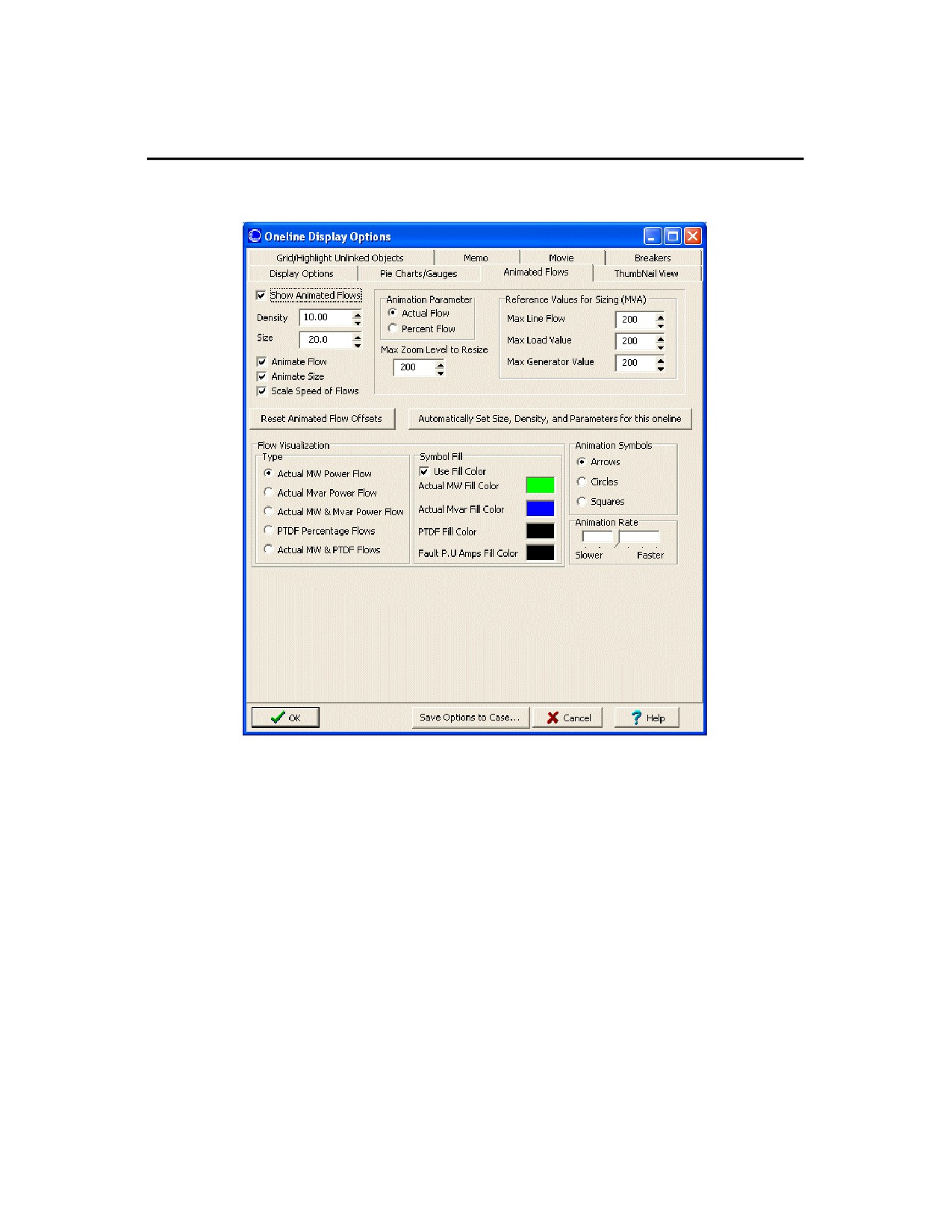
The fields on the Animated Flows page of the Oneline Display Options dialog are used to customize the appearance of
the animated flows on the oneline diagram.
Oneline Display Options Dialog - Animated Flows Tab
Show Animated Flows
Determines whether power flows are animated on the onelines. If this option is not checked, then no flow symbols
appear on the oneline.
Density
Determines the relative density of the animated flows on the devices. Increasing this value causes Simulator to
display a greater number of flow symbols per unit distance on the oneline. This value may range from 1 to 999.
Size
Determines the relative size of the animated flows on the devices. Increasing this number increases the size of the
flow symbols. This field may range from 1 to 999.
Animate Flow
This option determines whether or not the flow arrows are mobile or stationary on the oneline diagram. Unchecking
this box will cause the flow arrows to remain stationary on the diagram.
Animate Size
If checked, the size of the animation symbols will vary to represent the quantity of flow on the element (respective of
the Animation Parameter.) Otherwise, the symbol size will be the same on all devices regardless of the quantity
represented.
Scale Speed of Flows
53
Checking this box will cause the arrows to flow at a speed proportional to the represented quantity. When it is not
checked, all of the flows will be at the same speed.
Animation Parameter
Determines whether the size and speed of animated flows represent actual flow or percentage loading. This option
applies only to transmission lines and transformers as flows on other devices, such as loads and generators, always
represent actual flow.
Max. Zoom Level to Resize
As a oneline is zoomed, the animated flow symbols increase in size. The value of Max. Zoom Level to Resize caps
the size of the animated flow s so that zooming beyond this level results in no further increase to the size of the flow
symbols.
Minimum Size in Pixels for In-service Elements
Allows the specification of a minimum size for the animated flow objects for power systems elements that are in-
service. The flow objects are sized based on the flow through the element. For elements with very small flows, it is
often difficult to see the flow objects, and the minimum size can be set to make these flow objects more visible. The
larger the minimum size value becomes, the more uniform the flow objects will become as elements are no longer
sized based on their actual flow but rather the minimum size.
Reference Values for Sizing
Maximum flow reference for sizing the animated flows. The lower the MVA reference, the larger the animated flows
appear on the oneline diagram as the actual flow value is compared to the reference value for scaling.
Reset Animated Flow Offsets
This button allows the user to reset the animated flows to start at a specified offset position. Mostly this would be
used to reset the offset to 0, which would cause the animated flows to start at the beginning of the line or element.
Since the animation moves the flow arrows every time the load flow is resolved, resetting flows to a specific offset
could be useful for comparing different load flow solutions by looking at differences in the animated flow objects.
Automatically Set Size, Density, and Parameters for this oneline
Simulator detects the current zoom level and object parameters of the selected oneline diagram, and automatically
adjusts the animation settings in an attempt to optimize the animation quality.
Flow Visualization
Animated flows on onelines may depict either actual power flows or power transfer distribution fac tors, depending
on what you choose here. You can also now choose to animate both the MW and MVAR flows or the MW and
PTDF flows simultaneously.
Use Fill Color
Checked if animated flow symbols should be filled using the Fill Color.
Symbol Fill Color
Shows the fill color used for the animated flows if Use Fill Color is checked. Double-click on these fields to change
the colors of the four different types of animated flows.
Animation Symbols
Simulator can display animated flows using directional arrows, circles, or squares.
Animation Rate
If the oneline animation is too fast or too slow, the animation rate can be adjusted by moving the slide bar.
54

Using Oneline Diagrams
Thumbnail View
The thumbnail view allows the user to see an overview of the oneline diagram in a smaller window in a specified
location on the oneline diagram. The thumbnail view is useful when the user has zoomed in to a specific area of the
oneline diagram, but still wants to see what part of the system they are observing on a larger scale as they pan around
the diagram. The thumbnail view is not visible by default, but can be set up and displayed from the Oneline Display
Options dialog. The options for the thumbnail view are:
Oneline Display Options Dialog - ThumbNail View Tab
Show ThumbNail View
If checked, the thumbnail view will be visible in the specified corner of the oneline diagram.
Size of ThumbNail View
The size of the thumbnail view as a percentage of the size of the oneline diagram.
Zoom Out Multiplier
The amount to multiply the oneline diagram zoom level for display in the thumbnail view. The higher the multiplier,
the more of the diagram you will see in the thumbnail view.
Location
Choose the location on the oneline diagram in which the thumbnail view is to appear.
Border Width in Pixels
The pixel thickness of the border around the thumbnail view.
Background Color
If Use One -line Background Color is checked, the thumbnail background color will be the same as the oneline
diagram. If it is not checked, then a different thumbnail background color can be selected by clicking on the colored
box next to the Use Custom Background Color label.
55
Percent Transparent
This setting allows you to make the thumbnail window completely opaque, completely transparent, or some
measure in between. The more transparent the thumbnail window, the more detail of the underlying oneline
diagram is visible through the thumbnail window.
56
Using Oneline Diagrams
Substation Display Options
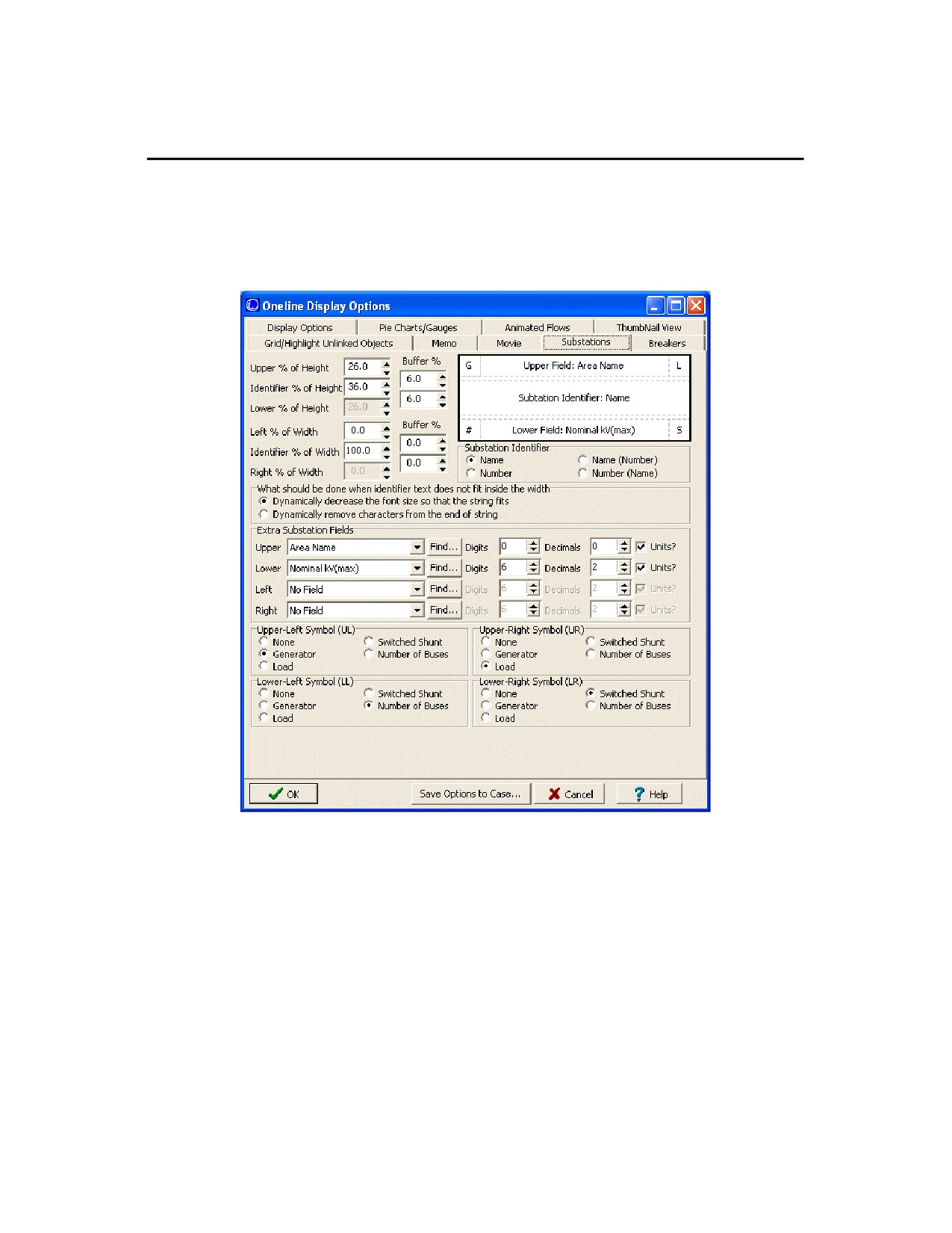
The Substations tab of the Oneline Display Options dialog provides parameters for customizing the appearance of
Substation display objects. This tab is only available if the case contains at least one substation.
The upper right-hand corner of the Substation page displays a template of the substation object’s appearance in terms
of locations or "zones" where information can be displayed on the object. The rest of the page can be used to
describe the appearance of the object and the information that appears in the substation objects.
Oneline Display Options Dialog - Substations Tab
Upper % of Height
This percentage indicates how much of the object is populated by the "upper" zone of the object. This includes the
Upper Field, Upper Left (UL) and Upper Right (UR). As you decrease this percentage, the upper zone will get
smaller, increasing the Identifer (middle) zone automatically, and vice-versa if you increase the percentage of the
upper zone.
Identifier % of Height
This is the percentage of the height of the substation object that is occupied by the identifier or "middle" zone. This
is the substation identifier section of the object.
Lower % of Height
This is the percentage of the substation object that is occupied by the "lower" zone of the object. This includes the
Lower Field, Lower Left (LL) and Lower Right (LR). Unlike the previous two percentages, this percentage cannot be
directly modified. Instead, it is automatically determined based on the settings of the Upper and Identifier
percentages.
Left % of Width
57
This percentage indicates how much of the object is populated by the "left" zone of the object. This includes the
Upper Left (UL) and Lower Left (LL). As you decrease this percentage, the left zone will get smaller, increasing the
Identifier (middle) zone automatically, and vice-versa of you increase the percentage of the left zone.
Identifier % of Width
This is the percentage of the width of the substation object that is occupied by the identifier or "middle" zone. This
is the substation identifier section of the object.
Right % of Width
This percentage indicates how much of the object is populated by the "right" zone of the object. This includes the
Upper RIght (UR) and Lower Right (LR). As you decrease this percentage, the right zone will get smaller,
increasing the Identifier (middle) zone automatically, and vice-versa of you increase the percentage of the right
zone.
Buffer Percent
The buffer width for the height settings provide a buffer zone of the percentage width specified horizontally between
the Identifier section and the upper / lower field sections. Similarly, the buffer width for the left and right width fields
indicates a percentage buffer vertically between the upper / lower field zones and the four corner zones.
Substation Identifier
Choose how the identifier will be displayed for the substation. Choose to display by name, by number, or by
combinations of name and number. The identifier will be displayed in the Identifier or "middle" zone of the
substation object.
What should be done when identifier text does not fit inside the width
As the name of this option suggest, you can choose how the text in the identifier section of the object should be
modified if resizing of the substation object causes the text to be too large for the modified size.
Extra Substation Fields
These two fields, represented as the Upper Field and Lower Field on the template, can be customized to display
any substation field of your choosing. Use the drop-down arrow of the Upper and Lower box to choose a field, or
use the Find button to pull up a list of fields to choose from. Once the field has been chosen, set the digits and
number of decimal places for the field.
Upper-Left Symbol (UL)
Choose what symbol to display in the upper-left zone of the substation object. You can choose from None,
Switched Shunt, Generator, Number of Buses, and Load. If the substation contains at least one type of the chosen
object, a symbol representing that type of object will be displayed in the Upper-Left location of the object to indicate
such a presence. By default, the Upper-Left zone will display the Generator symbol.
Upper-Right Symbol (UR)
Choose what symbol to display in the upper-right zone of the substation object. You can choose from None,
Switched Shunt, Generator, Number of Buses, and Load. If the substation contains at least one type of the chosen
object, a symbol representing that type of object will be display ed in the Upper-Right location of the object to
indicate such a presence. By default, the Upper-Right zone will display the Load symbol.
Lower Left Symbol (LL)
Choose what symbol to display in the lower-left zone of the substation object. You can choose from None,
Switched Shunt, Generator, Number of Buses, and Load. If the substation contains at least one type of the chosen
object, a symbol representing that type of object will be displayed in the Lower-Left location of the object to indicate
such a presence. By default, the Lower-Left zone will display the number of buses in the substation.
Lower-Right Symbol (LR)
Choose what symbol to display in the lower-right zone of the substation object. You can choose from None,
Switched Shunt, Generator, Number of Buses, and Load. If the substation contains at least one type of the chosen
object, a symbol representing that type of object will be displayed in the Lower-Right location of the object to
indicate such a presence. By default, the Lower-Right zone wll display the Switched Shunt symbol.
58

Using Oneline Diagrams
Set Custom Detail Dialog
This dialog is opened from the Set Custom Detail button on the Oneline Display Options dialog. The Custom Detail
Dialog allows you to choose particular regions and devices for display on a oneline diagram. The Custom Detail
settings are temporary settings that allow "hiding" certain parts of a oneline diagram that may not be of interest for your
current needs. This option is only available during run mode. Any custom detail settings being used in run mode will
automatically be removed when switching to edit mode.
New in version 11 is the ability to store the custom detail settings by assigning a name to the set of customizations.
This makes it easier to reapply custom detail settings by opening the Custom Detail dialog and choosing the criteria by
name from the list of stored criteria settings.
Set Custom Detail Dialog
General
Area Numbers
Specify the areas for display. By default, all areas are displayed. You can assign specific areas by entering in the
area numbers, separated by a dash f or a range of areas, and commas for individual areas. You can also click the
Find… button to search for areas by number or name.
As an alternative, the Areas tab allows you to select or deselect areas to include in the custom display settings.
Zone Numbers
59
Specify the zones for display. By default, all zones are displayed. You can assign specific zones by entering in the
zone numbers, separated by a dash for a range of zones, and commas for individual zones. You can also click the
Find… button to search for zones by number or name.
As an alternative, the Zones tab allows you to select or deselect zones to include in the custom display settings.
Nominal Voltage
Specify the voltage range of the devices for display. By default, all voltage levels are displayed. You can assign a
specific voltage range by entering the minimum and maximum nominal voltage values.
Type of Drawing Object
This list displays all the types of devices that can be displayed on a oneline diagram. To choose the types of
devices for display, click the check box next to each type you wish to keep on the diagram. If you wish to display all
the types of devices, you can click the Check All button or check the Show All Types option. If you wish to
uncheck all selected types of objects, you can click the Uncheck All button.
Layers
Use the Layers tab to specify the layers for display. You can use the Check All or Uncheck All buttons to select or
unselect all the layers in the list.
When you are finished setting the Custom Detail options, you can click OK, only show these, and the oneline
diagram will be redrawn, hiding any devices that do not meet the settings. If you wish to remove a Custom Detail filter
from a oneline diagram, you can re-open the Custom Detail Dialog, and click the Remove button. The oneline
diagram detail will be returned to normal.
60
Using Oneline Diagrams
Oneline Animation
An important feature of PowerWorld Simulator is its support of animated onelines. The use of efficient display
algorithms allow animation rates that are typically greater than several times per second, even on large cases and on
onelines with a significant number of objects. The extensive use of animation makes the display "come alive" so that
system conditions can be ascertained more easily.
In Simulator, animation is started from Run Mode by selecting Simulation > Play. In Viewer, animation is started
automatically when you load a case.
The animation can be controlled and customized from the Animated Flows Tab of the Oneline Display Options Dialog.
To access this dialog, select Options > Oneline Display from the main menu, or right-click on an empty area of the
oneline diagram and select Oneline Display Options from the resulting local menu.
61